this is a page for small tutorials on how to do various little things around your web site.
sometimes what you want is "how do i make my page look nice", not "how do i learn html and css."
so here is how you make it look reasonably nice with minimum effort.
i'm bad at colors, so i steal palettes from lospec and coolors that other people have made. let's do that now; skimming through popular palettes, let's take this one. #211e20, #555568, #a0a08b, and #e9efec. very mild-mannered, very normal.
hot tip: off-black and off-white are a great lazy way to make something look like you put way more thought and effort into it than you actually did!
make a div and call it "container" (or whatever you want. i don't care. this one's called container because it's the container.) put everything inside of container.
define a width for the box & a maximum width. also center the box. width:70% makes container take up 70% of the browser window, width-wise; max-width means that it won't get any bigger than 1200px no matter how big the browser window is. "margin:auto" centers it horizontally.
also give the box some padding.
apply colors to css. for the font color, just say "color"; for the background color, say background-color. easy-peasy.
you'll also want to change the color of links, because the default blue and purple will probably look bad with your palette. links are called "a".
just pick something out. you can use google fonts for this. you can host font files on your own site, but we're being lazy right now. as long as it isn't the default font it'll look like you put in way more effort than you actually did.
lots of people like atkinson hyperlegible. so let's go with that. embed the head code in the head, like google says. then put "font-family: "Atkinson Hyperlegible", Helvetica, sans-serif" in your css for the body. each of those secondary fonts listed is a backup font; so, the font will be atkinson hyperlegible if possible - if that doesn't work, it'll be helvetica, and if that doesn't work it'll be whatever the person's default sans-serif font is. you can have as many options as you want.
you're nearly done. hang in there! you can stop now if you want, but i think these are good to do as well.
center header text and add a border to the container. if you want to! if not, don't.
"border: size color style" is the formatting there.
a thicker border will give it a bit of a chunkier more friendly look, and thinner looks a bit classier.
there's actually a lot of styles of border you can have besides solid: dashed, dotted, double, inset, outset, and ridge. (you can also set images as borders instead, but it's a bit annoying and fiddly.)
now your website looks fine. if you want to keep dolling it up further, here are a few other easy things to do:
if you want rounded corners on a box, that's what the "border-radius" property is for!
this is a size property, so you can use pixels or percent or whatever else. if you set it to 100% it'll make the div circular (or as close as it can get - if it's a square it'll become a circle, if it's a rectangle it'll become an oval.) smaller number = subtler curve, bigger number = bigger curve.
you can change the color of the scrollbar and the color of highlighted text! a subtle touch but adds a nice sense of effort and depth.
now your website looks pretty good and you more or less understand why it looks the way it does! this palette and code was used to make this very page, by the way.
this is an elaboration on the previous tutorial, so look at that first! here you can make that same layout but this time with two columns next to each other instead of just one column. it's a bit more involved, but not too bad!
make a box like in part 1! but this time, add "display:flex" to it. i'm also going to make it a bit wider, since we've got two columns instead of just one.
now put two boxes inside of that box. the first box will be smaller, so it can be a sidebar. the second box will be bigger, and be the "main page".
put some stuff in those boxes. the main page should be in secondbox, since it's the big one.
you know how to do that, remember? just copy and paste the same stuff from the previous tutorial!
let's just do everything the same as for the first tutorial - same color palette, same font, same everything. the only real difference is that this time you're applying your changes to the two inside boxes instead of the container.
now my page looks like this:
See the Pen make it look nice fast 2 by wretch (@xixxii) on CodePen.
check the css and html on codepen if you feel lost or confused!
this layout is pretty serviceable! you can just stop now and take your two columns and go, if you want.
you may want things in the sidebar to be a bit smaller than things in the main box; the h1, for example, which is spilling out!
you can modify "h1 inside of firstbox" in css like this!
if you would like to add a bit of space between the columns, you can do that! with a flexbox, you can just specify a "gap" - and the flexbox will add that gap between the items.
the columns right now are the same height. if you want them to be different heights, that can be accomplished! try adding another line to .container.
this tells the flexbox where to put the items! try swapping between the two. you might prefer one over the other.
this is much easier than it sounds!
let's break that down. first, a media query: @media only screen and (max-width: 750ps). this says "when the screen is 750px wide or smaller, do this. then it's got brackets like other css classes, and inside of those brackets we put a couple of instructions.
first, we tell the container to start wrapping. that means that it will move a div onto another line, basically.
then, we tell the boxes to be 100% the width of .container instead of 20 and 80 percent.
a bonus: you can decide what order you want things to appear in in a flexbox! so, if you would like the sidebar (.firstbox) to be under the main content instead of on top, you can do that very easily! you just add in an "order" property.
now, with a few adjustments in place, the site looks like this:
See the Pen make it look nice fast 2 (adjusted) by wretch (@xixxii) on CodePen.
and there you have it! a two-column layout!
it's not too bad, depending on what you've gotten up to.
look at your website. make your browser window smaller. see how small it can be before it starts looking bad. use this to fix it:
this controls the css for the site when the browser width is 800px or smaller. set the number to the size at which things start looking bad. do css inside of those brackets and change stuff around until it looks good.
you can have multiple sets of these if you want - one for 800px, one for 600px, et cetera.
phones tend to be somewhere in the 700-900 width range, i think. different brands are different specific sizes though.
adding "max-width:100%" to some things may help; this will stop them from being bigger than the screen.
you can also add "display:none;" to something, so that it won't appear at all if the screen is too small. this is useful if you want to have a totally different navigation or hide big decorative pictures for example.
you can also have things in your normal css that are display:none and have a different display property on mobile. for example, if you're on a big screen you can see a picture of a kitten below this paragraph, but if you're on a smaller screen it's a wizard. (you can resize the browser window to see the wizard if you're on a computer).
you can use this to make your website completely different on a phone than it is on a computer, if you want! the power is in your hands! you could make the colors different or hide all your divs or have a secret or... whatever your heart desires. it's just css after all.
if you are finding yourself frustrated or perplexed by how an image looks when shrunk down for a stamp or 88x31 button (for example, it's really blurry), it may be because of the type of resizing you're doing!
here's my example image: i'm going to shrink it down to small size in the program paint.NET, a free image editing program whose website is, infuriatingly, not paint.net.
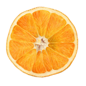
in order: bilinear, bilinear low quality, fant, adaptive sharp, lanczos, bicubic, bicubic smooth, nearest neighbor, and the last one is the big image resized by changing the width in html!
they each have the name of the resizing method used in the "title" attribute so it'll show if you mouse over.
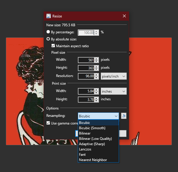
resizing options look like this in paint.NET (probably similar elsewhere)
(if you're curious, the image is a cover of a smutty 20s magazine (public domain!) that i edited to tidy up a bit because i like the covergirls.)
add a transition to things to incorporate a tiny bit of animation without needing to figure out how animations work at all!
say i have a picture. i display it small, but make it so that when you hover over the small picture it gets bigger! like so. (put your mouse cursor on the image)
this hover effect is pretty abrupt! but you can add a transition time and it'll become smooth!
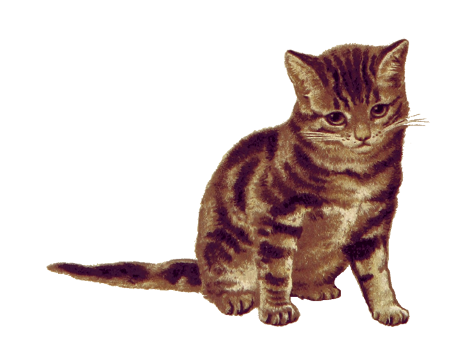
behold: my cat! hover over this picture.
you can make the transition longer or shorter; 0.5s is half a second, but you can put it in milliseconds too if you want extremely precise control.
this timing will apply to all transitions to that an object has. for example, the containers on this page have a transition so that when they change size in a small window it isn't so abrupt! (shrink your browser window.)
this is totally unnecessary but a nice touch to add in combination with hover effects. i like to make links grow big when hovered over, for example, and put a transition on them so it's nice and smooth.
it's very satisfying with border-radius. check this out.
sometimes you want to put an image in a place in a kind of messy way - treating your web site like a scrapbook or piece of paper, perhaps! here is how to do that.
position:absolute lets you use top: and bottom: and left: and right: to precisely position an image!
for example, this bear sticker. click on it to activate its placement! (you'll have to scroll up to see it)
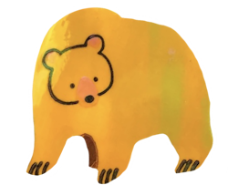
try resizing your browser window to see how the placement works. the sticker will always be 200 pixels away from the top of the page and 333 pixels away from the left of the page, even if that puts it on top of other things or off the page entirely.
since the boxes on this page are resizing with the window, though, the bear's location isn't really playing nice with the layout.
if you give a box "position:relative", though, and put the bear inside of it, then the absolute positioning will be relative to that box, rather than relative to the page.
that sounds a little confusing, so here's an example - click on this bear and it'll be given the exact same positioning - but this time it's inside a box with "position:relative".
this box is 400 pixels wide and 300 pixels tall! so, 200 pixels from the top and 333 pixels from the left is the bottom-right corner.
a better way to put it at the bottom-right corner, though, would be to tell it "bottom:0; right:0;". that way it'll always be in the bottom right, even if the size of the container changes.
this third bear is inside of a resizing box! its height AND width will change when you resize your window, but he'll stay put.
you can use negative numbers, too - giving a right of -50px, for example, would put him partway outside of the box!
if you want something to be anchored to a particular element, it's good to put it inside of that element rather than having it anchored to the page itself.
of course, if your whole layout is nailed down and won't resize or move around, then it's not a problem!
if you want to put a lot of things on your page, then you might want to look into making the whole page a grid so it's a bit easier to keep track of where you're putting everything -- but you don't have to!
you probably know that you can give your divs and images margins; you might not know that you can give them negative margins, too. check it out:
as you can see, this affects the things around it, too.
this margin trick is helpful if you want something to be just a little bit overlapping or make a pile. for example, here the first smiley is normal, but all the others have a margin-left of -50px.
if you want an image to be outside of the box it's in, make sure that box doesn't constrain the overflow!
if the contents of a box are outside of the box - "overflowing" - then adding overflow:auto or overflow:scroll to your box contains the overflow inside of the box and adds a scrollbar. this is useful for text, but not for decorative images that you've put out!
i shall illustrate what i mean, since i'm bad at wording things...
all well and good there! but here's the same setup with overflow:auto on the box.
so that's important to keep in mind if you want your boxes to have scrolling instead of growing infinitely AND silly decorative images!
you can actually control which things go on top of or underneath other things, when you're positioning them. this is accomplished using the power of z-index!
X is the horizontal axis. Y is the vertical axis. there is also... a Z axis! that's the third dimension! a bigger number is closer to you; a smaller number is further away. think of it as layers.
by default, things display in order of appearance. if you have three images:
the order of the layers is smiley face on the bottom, orange on top of that, and the bear on top of that, because that's the order they were put on the page. so, like the margins example above, they'd look like this if you had them overlapping:
but what if i want the smiley face on top, even though it's first? what if i want my stickers to be underneath my site's content, so nothing gets covered up? z-index time!
heads up: z-index only works on positioned elements; absolute, relative, fixed, and sticky!
let's put these three stickers in a pile using their margins, then give the smiley face position:relative and a z-index of 100.
ta-daa! it's on top! now only something with a z-index of 101 or higher can be on top of that smiley face.
with this, you can have a later element underneath an earlier one, or an early element on top of a later one.
what a marvellous glow this box has! amazing! here's a quick overview of these funny little css properties.
you can add "box-shadow" to boxes, and "text-shadow" to text. these shadows have 5 properties: horizontal offset, vertical offset, blur, spread, and color.
a blurry shadow with no offset in a light color will make something look like it's glowing!
the same is true for text!
you do have to be careful, though... some kinds of shadows and colors can make the text a bit hard to read. but they can add a cool subtle touch!
a darker shadow, of course, looks more like a real shadow. this can be used to add a bit of skeumorphism to your site. here's a really subtle shadow, for example:
a shadow doesn't have to be blurred! it could just be offset.
and you can give one box or text multiple shadows, if you want, by separating the shadows with commas. like so!
of course this looks pretty bad, but it's fun to know it's possible!
a weird thing that you can do with shadows is that while they're outset by default... you can make them inset instead! you can make it look like there's a hole in your div!
i think a nice touch is to add a hover effect with a transition with box shadows. try hovering over these! pretty cool i think!