exploring web design - exercises & links
i got this book out of the library and wanted to compile the exercises it has for developing web design skills as well as all the websites it mentions!
the book was published in 2005; it has a pretty good overview of basics of web design and includes some very charming negative examples of what not to do as well as many examples of "good" web design! each chapter has some review questions to make sure you were paying attention and also a couple of exercises for helping you learn. i think the exercises would make good practice or be really helpful as prompts for getting unstuck or warmed up.
exercises
these are the exercises in the book; for the ones which reference stuff earlier in the chapter i've added the necessary context.
Chapter 1: Make the World Wide Web a Better Place
1. Surf the Web and find five sites you really like. Study each site and write out a detailed list of the elements that attract you to this site.
2. Find five sites you don't like. Study each site and write out a deetailed list of the elements that you could do without.
3. Design two fictional web sites: one for Grandpa Joe's Denture Cleaning Service, and one for Spike's Extreme Tattoos and Piercings. If you don't have access to web design software, or don't kknow how to use it, just sketch out your designs on paper and color them with colored pencils, markers, or even crayons. Think about how and why these two sites should be different.
4. Look at each of the sites you designed in exercise #3. Based on what you learned in this chapter, critique these designs. List the good points and bad points of each, and explain.
Chapter 2: Successful Website Layout
1. Create a mock website for each of the fourteen different layout styles described on pages 26 through 36.
The layout styles
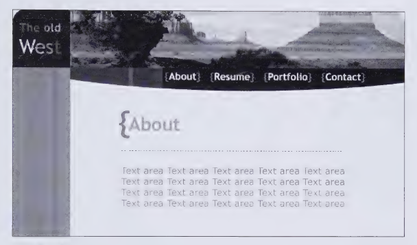
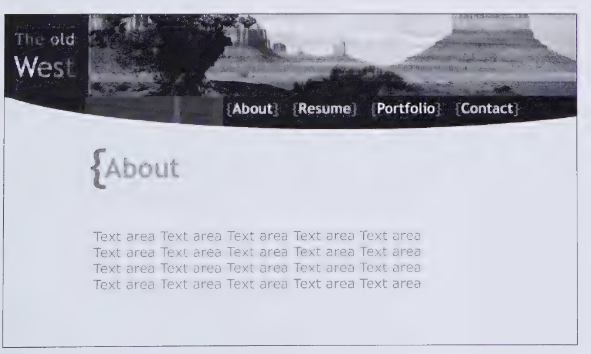
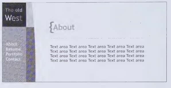
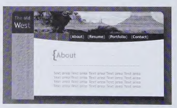
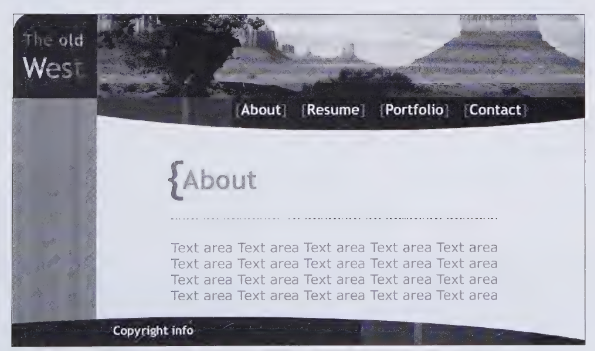
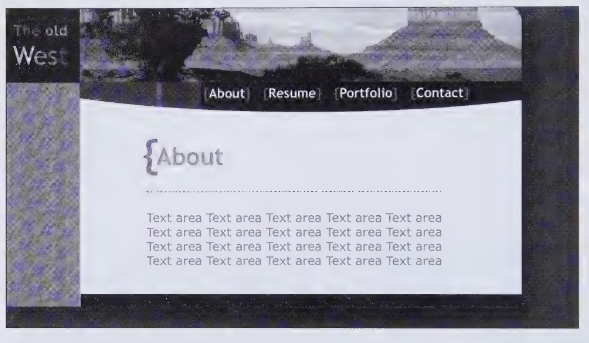
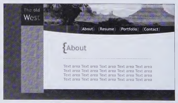
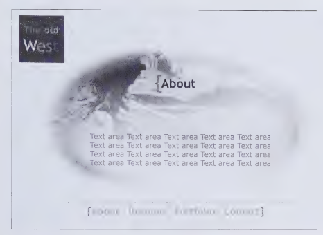
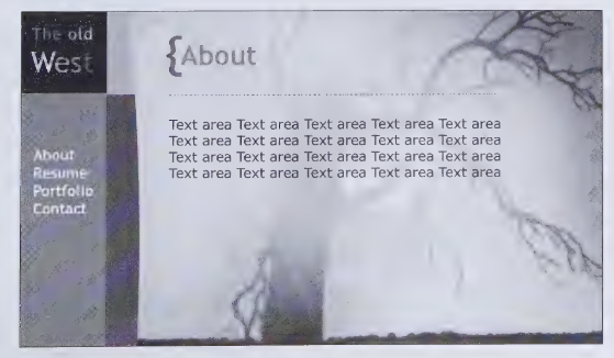
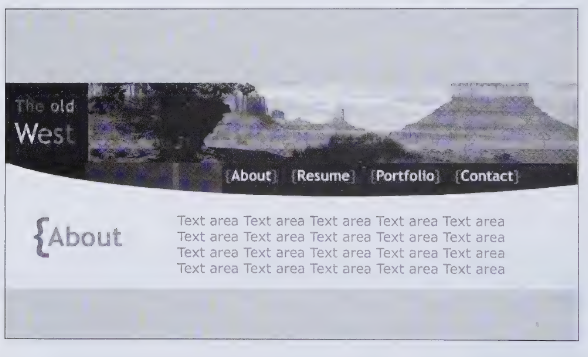
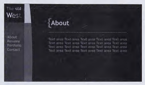
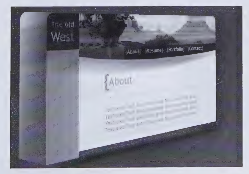
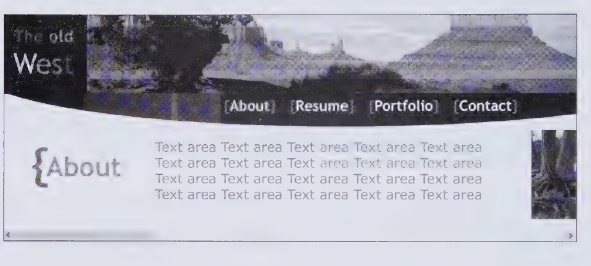
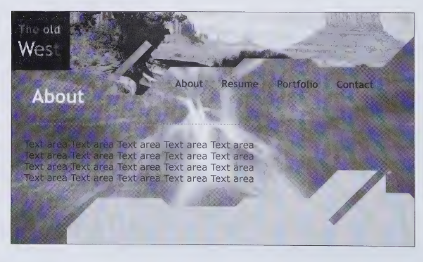
2. Create a mock website rough layout using your name as the logo. The links should be About, Resume, Portfolio, and Contact. Use all principles learned in this chapter and use good design principles.
Chapter 3: Web Typography
1. Design a new site or open up a site that you have already designed. Try out the ten main fonts on the text of the site. Notice how Georgia and Verdana differ from the other fonts. Choose the font that is easiest to read and best expresses the theme of your site.
The 10 main fonts
- Times New Roman
- George*
- Courier
- Serif**
- Arial
- Verdana
- Helvetica
- Geneva
- Corsiva
webmaster notes:
* pretty sure this is supposed to say "georgia" so i put it in georgia.
** i don't think these are real fonts but it's in the book so it's on the list!
2. Experiment with different color combinations. Choose a background color, and try to find the font color that is the easiest to read. Here's a tip: step away from the monitor and look at it from about three to five feet away. The colors should look good from that far away.
3. Design a header using graphics design software. CHoose a word that is linked to certain ideas and emotions, and use a font that helps to convey this. IN a critique, ask others to describe what the font suggests to them and compare it with your goals.
4. Make a typography image. You can choose a topic, or simply use your name, or even your first initial.
Chapter 4: Color Theory
1. Design websites using only colors and shapes (no text, no photos, no illustrations), based on the following themes. For each site, do your best to convey the moods and attitudes associated with that theme. SHow your completed design to at least one other person. Ask them what they feel the colors represent, and compare their responses to your goals.
a. Site: Corporate
Demographic: wide range of ages and backgrounds
Desired mood or theme: security, honesty, professionalism
b. Site: Child-related
Demographic: children under twelve and parents
Desired mood or theme: fun, stimulating, impulsive
c. Site: Extreme Pop Culture
Demographic: teenage to young adult, mostly male
Desired mood or theme: exciting, cutting edge, intense
2. Design a website based on a monochromatic color scheme. You must use the same color throughout your design, but you can vary the tint, shade, and saturation as much as you want. You may also include black and white.
3. Choose three of the color schemes we discussed and design one website for each scheme.
Discussed Color Schemes
- Monochromatic - A monochromatic design uses only one color.
- Analogous - Uses three to five colors that are right next to each other on the color wheel. For example, you might choose green, blue-green, blue, and blue-purple.
- Complementary - Uses colors that are opposite one another on the color wheel. For example, blue and orange.
- Split Complemetary - To get a split complementary scheme, select your color, and then look to the color wheel for its complement. THen look at the colors that border the complement on each side. For example, if you choose orange as your main color, you won't use it with its complementary blue, but with blue-purple and blue-green.
- Double Contrast - You choose your main color and its complement - for example, yellow and purple. Then you choose the colors on the right, next to your main colors. So if your complementary colors are yellow and purple, you would choose blue-purple, red-purple, yellow-green, and yellow-orange as your colors to design with.
- Triadic - Based on three colors that are equal distances apart on the color wheel. If you draw lines to connect the three colors, it will form a triangle. For example, the three primary colors - red, yellow, and blue - form a triadic color scheme.
Chapter 5: Web Accessibility
1. Visit the website for Bobby (www.cast.org/bobby/) and test three of your favorite high-profile websites for accessibility. You might be surprised at the results. For each one, write out an action plan that outlines what could be done to improve its accessibility.
2. Design a website using at least two tables with at least six cells each. Make sure you use row and column headers (the TITLE attribute). Draw out a "map" of your site that shows all tables with the row and column headers written in. Draw boxes for each image and write in the alt tag information that you have coded for your site. Give the map to a friend and ask him or her to act as the text reader while you navigate. Now, place your fingers on the TAB and SHIFT keys (TAB to go forward, SHIFT+TAB to go backward), and close your eyes. Your friend should read the contents of each cell (beginning with the headers), and the ALT tags for each image as you navigate to them. See how well you can navigate your site without peeking.
3. Design a website with the same specifications as in exercise #2 (you can use the same one if you've already done it). Keep your eyes open this time, and try to navigate the site without using the mouse. If you can't do it, go back and redesign it until you can.
4. Design a website and keyboard enable each major section. For an extra challenge, include a form and keyboard enable each response. WHen you're finished, try to navigate the site without using your mouse at all.
Chapter 6: Turning your Creative Potential into a Reality
1. Surf the Web and find five themed websites. List the theme of each site, and write negative and positive comments on each theme.
2. Write a portfolio plan for yourself. Take inventory of all the pieces of work you currently have for your portfolio. Write out ideas for other portfolio pieces and set a date for your portfolio to be done.
Chapter 7: Multimedia and the Future of Web Design
1. Think about all the technological innovations you've encountered in science fiction books and movies. How far in the future do you think wrist communicators and electronic paper are? Design a website that would work if a user was viewing it on a wrist communicator. Create this site in several stages representing how it would change interactively, and write a brief explanation of how these changes would occur.
2. Look at some interactive Flash sites on the Web and then sketch out a storyboard on paper of a Flash interface you'd like to create. This means sketch out your design in separate frames, as if you were drawing a comic book with multiple panels on each page. Let each frame represent a different stage of your interactive animation.
3. Sketch out an idea for a quick interactive game someone could play on your website. Nothing complex - make it simple, but interesting.
4. Write out a description of what you think it will be like to access the World Wide Web twenty years from now. You can write this as a straight-forward essay, or treat it as a creative writing assignment and write it as a short-story. Check out the Vodafone Future Vision Website (www.vodafone.com/futurevision) [note from me, the webmaster: this link does not work and is not archived :(] for inspiration.
Links
this is every url mentioned in the book!
interestingly, the book was written right in the middle of the boom of flash-based websites being very exciting and cutting edge! images and flash animations are usually but not always preserved on the wayback machine.
links with an * are no longer up, but are in the internet archive - the link goes to an archive from around 2004.
links with an x are not up and i could not find an archive of the site as seen in the book on the wayback machine. (i didn't look that hard, though.)
links with an *x are to somewhat broken wayback machine archives.
links with a ~ are redirects or are still up but kinda broken. in some cases they might be new owners of the same url.
links with no mark are links that still work on 9/24/2024!
- exorcistthebeginning.warnerbros.com *
- www.derekmathews.com x
- www.pulseworks.tv/index3.htm *
- www.thechoppingblock.com ~ (this link works, but the old version is not on the internet archive)
- www.2advanced.com/portfolio/joshtodd *
- www.showlogic.com *
- www.k10k.net *
- www.stephenbliss.com
- www.hansliebschercopprwks.com x
- www.jiong.com *
- www.goapply.com *
- www.locksoflove.org *
- www.01-la.com *
- www.immigrantindustries.com/immigrantrecords x
- www.tdcollins.com
- www.jalvamedia.com *
- www.createonline.co.uk x
- www.xs-engineering.com *
- www.decembermarketing.com
- www.papeldigital.pt ~
- www.fahrenheit.com/main.html ~
- www.itcatmedia.com/school ~
- www.i360.net ~
- www.thecookingguy.com
- www.claudia-stein-design.de *
- www.dreamless.com *
- www.ezitsolutions.com/main/index.php ~
- www.usdoj.gov/crt/ada/adahom1.htm ~
- www.cats.org.uk
- www.w3c.org
- www.cast.org/bobby ~
- www.watchfire.com
- ncam.wgbh.org/webaccess/magpie/index.html ~
- www.jobenwebdesigns.com *
- www.keytools.com ~
- www.westonfl.org
- dramabug.com *
- www.fox-company.com *
- spacex.com
- uncomputable.org *x
- www.000-000-0000.com ~
- www.cubadust.com
- www.jasonhutton.net *x
- www.heading1.com *x
- www.vc.edu/aiga x
- www.culinard.com *
- www.dragonfly3d.com *x
- www.liquidintelligence.com *
- www.diasin.com *x
- www.neostream.com ~
- www.vconline.edu *x
- https://www.vodafone.com/futurevision ~x