About this
This is a modular layout with a bunch of different boxes you can combine and arrange to suit your preferences! Ideally, this gives you a bunch of flexibility without you needing to do any CSS if you don't want to!
There are 4 sizes of box: small, medium, half, and large.
Boxes can be customized by adding additional classes: short, reverse, borderless, tiltright, tiltleft, empty, taped, and picturebox!
There's additionally a simple gallery setup for displaying lots of pictures.
On this demo page I've put examples of every kind of box. Sorry if it's a little overwhelming or too much information... you can experiment with different combinations of boxes to see what you like!
This layout works on mobile & is javascript-free.
This was going to be for the 32-bit Cafe Tea Party jam, but I thought it wasn't really coffee- or tea-related enough to justify submitting it....
Filler text
Pellentesque habitant morbi tristique senectus et netus et malesuada fames ac turpis egestas. Vestibulum tortor quam, feugiat vitae, ultricies eget, tempor sit amet, ante. Donec eu libero sit amet quam egestas semper. Aenean ultricies mi vitae est. Mauris placerat eleifend leo. Quisque sit amet est et sapien ullamcorper pharetra. Vestibulum erat wisi, condimentum sed, commodo vitae, ornare sit amet, wisi. Aenean fermentum, elit eget tincidunt condimentum, eros ipsum rutrum orci, sagittis tempus lacus enim ac dui. Donec non enim in turpis pulvinar facilisis. Ut felis.
Header Level 2
- Lorem ipsum dolor sit amet, consectetuer adipiscing elit.
- Aliquam tincidunt mauris eu risus.
Lorem ipsum dolor sit amet, consectetur adipiscing elit. Vivamus magna. Cras in mi at felis aliquet congue. Ut a est eget ligula molestie gravida. Curabitur massa. Donec eleifend, libero at sagittis mollis, tellus est malesuada tellus, at luctus turpis elit sit amet quam. Vivamus pretium ornare est.
Header Level 3
- Lorem ipsum dolor sit amet, consectetuer adipiscing elit.
- Aliquam tincidunt mauris eu risus.
small
A basic "small" div. It takes up a third of the width of the container.
medium
This is a "medium" div. It takes up two-thirds of the width of the container!
half
A "half" div will take up half the width.
half short
For a short box, add the "short" class! A box can have multiple div classes, like this one here.
reverse
For a div with the background color as the text color and the text color as the background color, add the "reverse" class.
borderless
For a box with no visible borders, add the "borderless" class!
tilt
To put a div at a jaunty little tilt to the right (like this one!), add the class "tiltright". For the same but to the left, do "tiltleft".
Empty
If you add the "empty" class, it won't have a background color. Combine with "borderless" to make an invisible div!
taped
You can add a little bit of tape to a div by adding the "taped" class! This also gives it a very slight shadow. Be aware that "taped" divs can't scroll if you put too much text in them, though!!
images
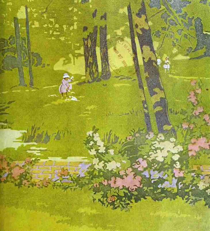
Add the class "picturebox" to a div if you want an image inside of it to fill the whole box. On the left is an example of a medium picturebox! The image will be resized and cropped by the CSS.
This works with big images and with small images. Try swapping between these two, if you want to see what that looks like. (the first one is very small, the second one is very big; they'll both be resized to fill the box!)

gallery
One more thing! A little 4-column gallery snippet for you, if you want it. Put an approximately equal number of images in four column divs and voila!
On mobile, it'll switch to 2 columns.
cool placeholder wizards


